

Toronto Cupcake
Website Redesign
About Toronto Cupcake
Toronto Cupcake was founded in August 2010 by Michelle Harrison to follow her passion for baking. As an avid baker influenced by her mother, Michelle established one of Canada's pioneering gourmet cupcake ventures in Toronto. They take pride in using premium ingredients to produce what they consider to be the most delightful treats available. Moreover, Michelle also specializes in crafting beautifully decorated cupcakes for various special occasions.
Project Overview
The website redesign project is undertaken with the objective of enhancing online sales. The primary focus is on improving the information architecture and restructuring the website to effectively increase sales. The key areas of modification included the navigation bar, cupcake card, and checkout process. These changes were implemented to create a visually appealing interface and optimize the user experience and drive a higher number of successful transactions, ultimately resulting in increased sales for the business.

Problem & Solution
Difficulty in navigation
Use of a burger menu instead of a navigation header
Hidden shopping cart within the burger menu
Poor image quality
Impact on visual appeal and product perception
Potential negative influence on purchasing decisions
Lack of information
Missing nutrition facts and allergy information
Potential customer concerns and limited ability to make informed choices
Unfriendly checkout process
Complex or confusing steps
Potential barriers to completing transactions and decreasing conversions
Absence of customer reviews
Inability to assess the quality of cupcakes
Lack of social proof and user feedback for potential customers
No option for guest sign-in
Limitation in user account options
Potential inconvenience for new customers and guest users
Problem Statement
Redesign the navigation
Replace the burger menu with a clear and intuitive navigation header
Ensure prominent visibility of the shopping cart
Enhance image quality
Upgrade product images for better visual representation
Increase customer engagement and trust through improved visuals
Provide comprehensive information
Include nutrition facts and allergy information for each cupcake
Address customer concerns and facilitate informed decision-making
Streamline the checkout process
Simplify steps and reduce friction
Optimize user flow to improve conversions and completion rates.
Incorporate customer reviews
Add a review section for customers to provide feedback on cupcakes
Enable social proof and assist potential customers in assessing the quality.
Introduce guest sign-in option
Allow users to make purchases without creating an account
Enhance convenience for new customers and guest users
Solution
Design Process
Heuristic Evaluation
User Interview
Affinity Mapping
Competitive Analysis
Scenario & Story Board
Persona
Information Architecture
User Flow
Visual Design
Mood Board
Wireframes
Sketches
Implementing Feedback
Usability Testing
Discover Phase
In order to assess the effectiveness of the proposed solutions for the Toronto Cupcake website, a heuristic evaluation was conducted. The evaluation aimed to identify usability issues and gauge the alignment of the website with established usability heuristics. We independently review the website and focus on key areas.
Heuristic Evaluation

1. The information on the website is poorly structured, with a burger menu instead of a menu in the header, which makes it difficult for users to navigate.

2. The shopping cart is hidden within the burger menu, which could lead to confusion for users.

3. The website lacks a footer.

4. The low quality of pictures on the website.
5. There is no price displayed on the product cards

6. The product image is not displayed in the cart. The cart page lacks a quantity field, preventing users from adjusting the number of cupcakes they want to order.
7. The checkout page is also problematic, with long, confusing text that is poorly structured, making it difficult for users to complete their purchases.
8. When users add an item to the shopping cart, there is no visible indication on the cupcake card, which could cause users to forget what they have added to their cart.

We started by conducting competitive research on six online cupcake stores. The major takeaways is as follows:
Competitive Analysis
Lola has intuitive navigation, extensive filters, specialized cupcakes for occasions, and customer reviews. The major weakness is the potential limited variety and customization options.
Major Takeaways
Hummingbird has Simple and easy-to-use website navigation, Effective filtering options for personalized searches, and Catering to various occasions with specialized cupcake selections. The weakness is Limited customization options for special dietary requirements and also there is no customer reviews for knowing about cupcakes and other products.
Cupcakes Wien has a user-friendly navigation menu and clear categorization of products, extensive filter options to refine cupcake choices, and a prominent emphasis on cupcakes for different occasions. The weakness is limited delivery services or the availability in specific regions.
Flavourtown & CupcakeStore has well-organized website navigation for easy access to information, categorizing cupcakes based on different occasions. The weaknesses is the accessible filtering option and limitations in customization options for special dietary requirements.
To better understand the challenges and concerns of purchasing online cupcakes, I conducted user interviews with 8 users who have experienced online cupcake ordering and synthesized our findings on an affinity map.
User Interview


5 major needs and concerns extracted from our affinity map:
Customise cupcakes based on their interest and special events.
Ingredient and dietary information.
Customer Review.
Delivery & Packaging.
The quality of the image on the website and based on the reality
Major Takeaways
Define Phase

Persona
Scenario & Story Board

Ideate Phase
we constructed a user flow that describes the pathways user might take while purchasing an item. This process helped me in
Understanding ways users can interact with the products
Allowing us to see navigation through user goals.
User Flow

Next, website map or site structure is designed. It is a visual representation or diagram that outlines the hierarchical structure and organization of the website's pages or content. It provides an overview of the website's architecture, showing the relationships between different pages and how they are interconnected.
Information Architecture

Design Phase
Through extensive research and careful consideration of user needs and concerns, we have created preliminary sketches that form the foundation of our design. These sketches have played a pivotal role in shaping our collective vision for the next stage of our design process.
Sketches


We have created a mood board that takes inspiration from the primary colors of the Toronto Cupcake website and other appealing websites. Our aim is to evoke a sense of taste and freshness through the carefully selected elements in the mood board. The colors chosen have been thoughtfully incorporated to attract and engage users, encouraging them to browse and explore more on the website.
Mood Board

UI Kit

Colors & Typography

Buttons
Componnents

UI Design

Home Page

Test Phase
To enhance the user experience, we conducted usability tests with a group of 5 users and collected valuable feedback regarding their interactions with our prototype. The users were assigned specific tasks to perform, and their feedback varied based on the tasks they completed.
Usability Testing

Iteration 1

Iteration 2

Iteration 3
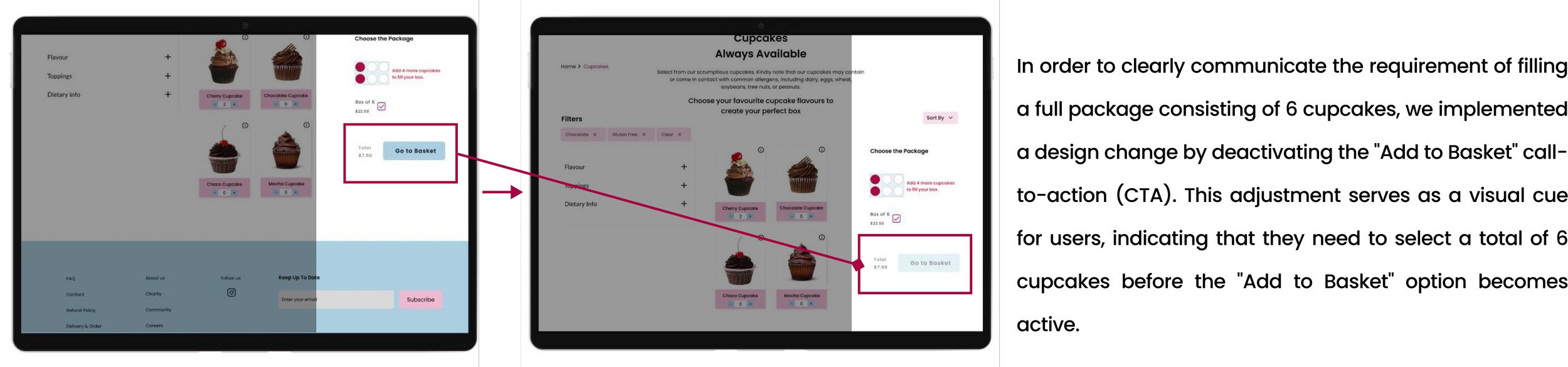
Iteration 4
Reflections
What I have learned from this project?
1. User Experience: Redesigning the Toronto Cupcake website allows me to assess the user experience and identify areas for improvement. I learn how to create a more intuitive and user-friendly interface, enhance navigation, and optimize the website's functionality to ensure a seamless browsing experience for visitors.
2. Visual Design: Redesigning the Toronto Cupcake website enables me to explore different visual design elements such as color schemes, typography, images, and layout. By analyzing the redesigned project, I can understand how these elements contribute to an appealing and cohesive visual identity, and learn how to effectively incorporate branding and aesthetics into web design.
What can I do next
Mobile Responsiveness: With the increasing use of mobile devices, it is crucial for a website to be mobile-responsive. I will work on creating a flexible and responsive layout that adapts to different screen sizes. This includes rearranging and reformatting content, adjusting font sizes, and optimizing the spacing between elements to ensure readability and visual appeal on mobile devices.